How much warmer is your city?

The world is getting hotter. July 2019 was one of the warmest months ever recorded - and July temperatures almost everywhere on Earth have been higher in the last 10 years compared with 1880-1900, as this globe shows. Scroll below to find out how the temperature in 1,000 major cities across the world has changed already and how much it could increase by in the coming years.
Scientists have warned we must limit global temperature rise to 1.5 degrees to avoid the worst impacts of climate change. That's compared to the temperatures in 1850-1900, before widespread industrialisation.
The earth has already warmed about 1C since then.
That may not sound like much, but if countries don't act to limit warming, our world could face "catastrophic change", according to the leading international body on global warming, the IPCC.
Sea levels will rise, risking the displacement of hundreds of millions of people. We'll also face more extreme weather such as droughts, heatwaves and heavy rains, and our ability to grow crops like rice, maize and wheat would be in danger.
If global warming continues at today's rate, temperatures may rise by 3-5C by the end of the century.
Find out how much the area around your city has already warmed - and what may lie ahead.
What could this lead to?

New York
United States of America
With a population of more than eight million, New York is one of the biggest cities in the world. But the city is vulnerable to coastal flooding and storm surges, such as the one that accompanied Hurricane Sandy from October to November 2012. Sandy flooded the subway and road tunnels entering Manhattan, caused blackouts and led to the deaths of more than 50 people.

Climate change is expected to lead to more intense hurricanes that dump more water. It is also causing sea level rise. New York's coastal location, with almost 1,500km of shoreline, makes it extremely vulnerable to these climate-driven impacts. The US emergency agency has projected that by the middle of this century, a quarter of the city - home to nearly a million people - will lie in flood zones.
The Arctic

The Arctic is highly sensitive to the effects of climate change, and is warming twice as fast as the rest of the world. It's thus seen as a canary in the coal mine for the impacts of global warming.
Like other regions of the world, the Arctic is seeing a rise in air and water temperatures. But the Arctic Ocean is covered in sea ice that melts in the summer and freezes again in the winter. In recent decades, that ice has been melting faster than it re-freezes in winter, causing it to decline. This is contributing to the large temperature change in the Arctic compared with the rest of the world.
Jakarta
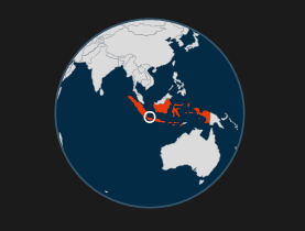
Indonesia
The Indonesian capital, home to 10 million people, is one of the fastest sinking cities in the world. The northern part of the city is sinking at a rate of 25cm a year in some areas. The dramatic rate is due to a combination of excessive groundwater extraction causing subsidence and sea level rise caused by climate change. A 32km sea wall and 17 artificial islands are being built to protect the city at a cost of $40bn.

But experts say this is just an interim measure. They argue that all groundwater extraction needs to stop by 2050, with the city learning to rely on other sources of water piped from reservoirs. But sea level rise will remain as a challenge, as it does for other coastal cities. The rise is because of thermal expansion - the water expanding because of extra heat - and the melting of polar ice.
Methodology
Why is my city not in your data?
Starting with a list of the 1,000 cities with the largest populations, we capped all countries to have no more than 40 cities per country. We then added in country capitals where missing and additional UK cities, bringing the total UK cities in the data up to the 40 most populous cities.
What is the globe showing?
The globe is showing how much July temperatures have increased in degrees Celsius between 1880-1900 and today. For recent years, a 10-year average 2009-2018 is used, to more accurately reflect recent warming. The temperature change data is stored in squares measuring 100x100km.
Why is there a cooler area over Siberia in the globe?
The globe is showing the change in average temperatures for July. This means the data looks a bit different to the change in average temperatures for the entire year. Also, because we are only looking at July temperatures in the 10 most recent years there could be some natural variability. For instance, Siberia has recently seen some summer cooling compared with our 1880-1900 starting point. Annual temperatures have increased everywhere over the same period. In particular, there has been more warming closer to the Arctic.
What area does the temperature for my city cover?
The temperature data for each city is not based on a specific weather station, but rather on the average temperature over a 100x100km grid. To get the data for a specific city, we took its central location, and used that to work out which grid the city lies in. The city then takes temperature data from that grid. This means two cities close enough to each other to fall into the same grid would return the same data.
Where does my city's temperature data come from?
For July and January temperatures from 1880-2018 we used monthly temperature data from Berkeley Earth. This dataset uses information from weather stations to calculate average temperatures across these 100km by 100km squares. There are 30,000 land monitoring stations included in the Berkeley Earth dataset.
When there was insufficient data for some locations, measurements from nearby stations were used to calculate the average. Berkeley Earth also adjusts for heat from cities or movements of the weather station.
The data from Berkeley Earth, comes in the form of "anomalies". This is a measurement often used in climate science, showing the difference from the average temperature of a baseline period, usually covering 30 years.
We wanted to show actual temperatures for each city, rather than anomalies. To do this, we calculated the average monthly temperatures for 1981-2010 for each city using the ERA-Interim dataset. This is a more precise and detailed temperature dataset that covers the period from 1979 to now. We then added the Berkeley Earth anomalies, adjusted to the same 1981-2010 baseline, to this average temperature, giving us the actual temperatures for each city and year.
To use the area around London as an example, July temperatures in 2018 were 2.73C above the 1981-2010 30-year average for July, which was 17.24C. Adding these together gives us the actual average temperature for the London area in July 2018, 19.97C. To make sure one particularly warm or cold year doesn't overly influence the data, we've looked at 10 year rolling average figures. For London, the 10 year rolling average July temperature, for 2009 to 2018, was 17.66C.
The months of July and January were chosen because July represents, for many locations, the height of summer in the northern hemisphere and winter in the southern hemisphere, with the reverse for January.
What about future temperature projections for my city?
For future temperature projections, we used predicted temperature data produced by climate models. Climate models are computer simulations of how the atmosphere, oceans, land, plants and ice behave under various levels of greenhouse gases. They help scientists come up with projections for what Earth will be like as global warming continues.
For this story, we used the multi-model mean dataset from the Coupled Model Intercomparison Project (CMIP5). The CMIP5 features 38 different climate models, however some of the different models are actually variations of the same underlying model with different aspects included. What the "multi-model" average means is that one run, or "simulation", from each model was used in calculating the final projections.
The CMIP5 multi-model mean is used by climate scientists in their long term projections for 21st century future temperatures. It is used as the basis of the Assessment Report by the Intergovernmental Panel on Climate Change (IPCC), a scientific body established by the United Nations and the World Meteorological Organization to examine and assess the latest scientific research into climate change.
The CMIP5 model data incorporated here includes temperature projections based on four different "pathways", which are different scenarios that our planet could follow - depending mainly on the amount and pace of greenhouse gas emissions that are released into the atmosphere. The conditions for each scenario are briefly described in the "How might this happen?" section that accompanies the temperature projection for each city in the chart above.
How did you bring data from these two different sources together?
The CMIP5 projected temperature data, similar to the Berkeley Earth data, represents the average temperature across an area for a particular month. In the case of the projected temperatures, these geographical areas correspond to squares measuring 250km by 250km, larger in size than the Berkeley Earth observed temperature grids.
The CMIP5 data was also rebased to the same 30-year period of 1981-2010 and we used the same method to work out the area each city lies in, which then enabled us to compare the past and future temperatures for each city. The change in average January and July temperature for each possible future projection is calculated against a baseline January and July temperature from 1880-1900. To calculate change we've calculated the 10-year rolling average for January and July for observed temperatures for each year from 1900 to today, and for projected temperatures until the end of this century, 2100.
How certain are these temperatures?
Predictions are never certain. Even today's temperature "readings" are imperfect. For example, when a measurement station has had insufficient data, readings have been taken from nearby stations. Scientists smooth the data to deal with issues or disruptions in data collection.
Future projections are even more uncertain. They depend on how much CO2 is in the atmosphere. This is shown by the different pathways.
They also depend on how you model the effect of CO2 on climate. The models the IPCC use estimate that climate sensitivity at between 2.1C and 4.7C per doubling of CO2 levels, compared to pre-industrial levels, with an average of 3.1C.
We are only reflecting the average value of 3.1C. With different inputs, we would see different outputs.
Even if the world follows one pathway exactly and climate sensitivity is exactly 3.1C and the models are perfect, the July temperature in a given year will depend on other things. We're showing ten-year averages, which smooth out some of the variation caused by things like El Nino.
Why doesn't the 2018 temperature match with data from the Met Office?
The average temperatures won't match exactly with observed temperatures from sources like the UK Met Office for example. This is because these generally come from a specific weather station rather than a larger grid area as described above and the characteristics of specific stations, like altitude, vegetation, or whether the location is urban or rural, can differ significantly from the average temperature of a grid box.
Additionally, reported observed temperatures tend to point to a more specific time period like a particular day, or the maximum temperature of that day, whereas the data in our interactive is an average temperature for the whole month.
Why does the average temperature for my city appear low?
Firstly, the temperatures are an average of both day and nighttime values, so are naturally lowered by the colder temperatures at night. Secondly, it's the average value for the whole month - smoothing out any unusually hot or cold days.
Credits
Design by Prina Shah and Irene de la Torre Arenas. Development by Alexander Ivanov and Becky Rush. Written and produced by Nassos Stylianou, Clara Guibourg and Paul Rincon. Help with the methodology and data analysis was provided by Zeke Hausfather at Carbon Brief, Karsten Haustein and Friederike Otto at theUniversity of Oxford Environmental Change Institute.
31 July 2019
BBC