Two Charts, One Grid: Clean Electricity Is Getting Cheaper But Feels More Expensive
The argument begins with a pair of charts that appear to contradict each other while describing the same reality. One plots nominal residential electricity prices against carbon intensity for the ten largest electricity producing countries in 2015 and 2024. The other uses the same data but adjusts prices for inflation. The first chart suggests that as electricity systems decarbonize, retail prices rise. The second shows that in real terms, electricity prices are flat or falling while carbon intensity declines. Both charts are correct. They simply answer different questions. One reflects how consumers experience bills in the moment. The other reflects how the economic burden of electricity evolves over time. The tension between the two frames explains much of the public and political confusion around electrification.
Full credit to Michael Caravaggio of US organization EPRI for the two charts. I saw David Fishman’s repost of Caravaggio’s post which featured the nominal price variant and went to Caravaggio’s post to ask exactly the same question others asked: how does the nominal vs inflation adjusted price compare? Someone else had asked the same question and Caravaggio provided the answer, with the US-centric proviso:
“I always struggle with that contention — a lot of folks don’t have wages keeping up with inflation – so it may not ring true to say well in real terms the rates are staying similar”
The charts track household electricity rates, a challenging number to normalize given static and variable adders on top of per kWh charges, on the vertical axis and carbon dioxide intensity on the horizontal axis. Caravaggio being with EPRI, my assumption is that these are reasonable and good numbers, and likely better than I would generate if asked. Each country has two points, one for 2015 and one for 2024, with an arrow connecting them. The arrows generally move leftward as grids decarbonize. In nominal cost terms, they also move upward. In inflation adjusted terms, most move downwards or at worst sideways. The magnitude of these movements matters. Across the sample, carbon intensity typically falls by 150 to 400 grams of CO2 per kWh over the period. Nominal prices rise by $0.02 to $0.10 per kWh in several cases. When adjusted for inflation, those same prices often fall by $0.01 to $0.05 per kWh. The direction of change flips depending on the frame.
These charts are not snapshots. They are trajectories. Each arrow reflects a system in transition. Interpreting them requires understanding where each country sits in terms of system maturity, not just how clean its electricity is at a point in time. Electricity systems move through phases. Early transition systems are still dominated by fossil generation and are focused on capacity expansion. Mid transition systems are building large volumes of renewables, transmission, and storage. Mature low carbon systems have already built most of their clean infrastructure and are operating assets with sunk capital costs. Prices behave differently in each phase.
Mature low carbon systems include countries like France and Canada. France generates about two-thirds of its electricity from nuclear, and when combined with hydropower and other renewables, over 80% of its electricity is from low-carbon sources. Its carbon intensity is around 50 grams of CO2 per kWh. Most of the nuclear fleet was built between 1977 and 1992. Capital costs were paid decades ago, at least the ones that were on the books as Macron is on record as saying he couldn’t discover the actual price tag. France’s retail electricity prices increased in nominal terms between 2015 and 2024, but increases were much lower once inflation are factored in. Variability in recent years reflects maintenance cycles and political pricing decisions, not decarbonization costs. Canada shows a similar pattern. Hydro dominates generation, with national carbon intensity near 120 grams of CO2 per kWh. Nominal residential prices increased in several provinces, but real prices declined or remained flat, with the highest prices in the most fossil heavy provinces. These systems demonstrate the end state of decarbonization. Once built, clean electricity is stable or declining in cost.
A second group consists of systems that are late in transition but still absorbing the costs of major policy choices. Germany and Japan fall into this category. Germany reduced carbon intensity from about 500 grams of CO2 per kWh in 2015 to roughly 350 grams in 2024. Over the same period, nominal residential prices rose by about $0.07 per kWh. Inflation adjustment turns that into a $0.03 per kWh reduction. Germany chose to exit nuclear while expanding renewables and grid infrastructure and both emissions and real electricity costs for consumers declined. Japan reduced carbon intensity only modestly, from around 550 to 480 grams of CO2 per kWh, while facing high fuel import costs after Fukushima. Nominal prices increased by roughly $0.05 per kWh. Inflation adjustment again turns that into a $0.03 per kWh decrease. In both cases, prices reflect transition and fuel exposure rather than an inherent link between clean electricity and higher costs.
Mid transition systems include the United States, Brazil, and South Korea. The United States reduced carbon intensity from about 520 grams of CO2 per kWh in 2015 to around 380 grams in 2024. Wind and solar additions exceeded 200 GW over the period. Nominal residential prices increased by about $0.04 per kWh on average. Adjusted for inflation, prices declined slightly. The United States remains fuel influenced, with gas setting marginal prices in many regions. Brazil has low average carbon intensity near 100 grams of CO2 per kWh due to hydro, but relies on thermal backup during droughts. Prices fluctuate with climate conditions rather than decarbonization spending. South Korea reduced intensity from roughly 470 to 410 grams of CO2 per kWh. Nominal prices rose, with real prices fairly flat. These systems are still building, but the real cost signal already shows stabilization.
Early transition systems include China and India. China reduced carbon intensity from about 680 grams of CO2 per kWh in 2015 to roughly 550 grams in 2024 while adding more than 900 GW of wind and solar. Retail prices remain low at around $0.08 per kWh, rising little in nominal terms and falling in real terms. Prices are shaped by state control and coal amortization. India reduced intensity only slightly, remaining above 700 grams of CO2 per kWh. Prices are low in nominal terms but rising as infrastructure expands. Both countries are putting in solar, batteries and enhanced grid technologies at a pace that should be the envy of the west, so will see declining carbon intensity with little negative impact on consumer electricity price, assuming minor policy effort to avoid backlash.
Looking across these groups, the pattern becomes clear. Early systems are cheap and dirty. Mid transition systems experience political tension and visible investment costs. Mature systems are clean and stable. The charts compress all three phases into a single plane, which invites misinterpretation. The cost of building a clean system is not the cost of operating one. Inflation adjusted prices isolate that distinction.
Inflation adjustment matters because nominal prices track currency erosion, not real economic burden. Between 2015 and 2024, cumulative inflation ranged from about 20% in Japan to over 35% in the United States. A $0.05 per kWh nominal increase over that period can represent a real decrease in cost. When electricity prices are deflated by consumer price indices, the long run trend across most large producers is flat to declining. This is consistent with learning curves for wind, solar, and batteries, where costs fell by 60% to 90% over the same period.
Consumers do not experience prices this way. Cognitive research shows that people anchor on nominal numbers, not inflation adjusted values. A bill that rises from $120 to $150 feels like a loss even if wages and prices elsewhere also rose. Electricity bills arrive monthly, are itemized, and are hard to avoid. Loss aversion amplifies the reaction. A $20 increase in electricity spending feels larger than a $30 decrease in gasoline spending. Mental accounting keeps these categories separate. The charts that use nominal prices align with perception. The charts that use real prices align with economics.
Inflation also disrupts reference prices. Many households remember electricity prices from a decade earlier as normal. When nominal prices rise across the economy, electricity becomes a focal point for frustration because it is a relatively fixed cost. This effect intensifies in unequal societies. In the United States, the Gini coefficient—a measure of how unevenly income is distributed across a population, where higher values indicate greater inequality—rose from about 0.35 in 1980 to around 0.42 by the early 2020s per international methodologies, while most of the rest of the G20 stayed within the 0.30 to 0.40 range. Median real wages grew slowly while housing, healthcare, and education costs rose faster than inflation. For households with limited slack, a $15 or $20 monthly increase in electricity costs can trigger real stress even if electricity represents less than 3% of total spending. The issue is not electricity prices alone but the shrinking margin for absorbing any increase.
This distributional context explains why inflation adjusted data fails to reassure. Aggregate statistics show that real electricity prices are stable. Lived experience shows that many households feel squeezed. In the United States, the bottom 40% of households spend multiple times the share of income on utilities compared to the top 20%. Rising inequity magnifies sensitivity to fixed costs. Electricity becomes a symbol of broader affordability challenges. Decarbonization is an easy narrative target because it is visible and policy driven, even when it is not the primary cost driver.
Electrification depends on electricity being perceived as affordable and stable. Heat pumps, EVs, and electric industrial processes shift energy spending from fuels to electricity. If electricity bills feel volatile or punitive, adoption slows. The data show that in real terms, electricity is becoming cheaper relative to fossil fuels. Gasoline prices fluctuated between $0.60 and $1.30 per liter in many countries over the period. Natural gas prices spiked by factors of five or more in Europe. Electricity prices moved far less, especially outside of countries like the UK where gas generation sets the wholesale price more often than not. Yet consumers respond more strongly to electricity because it is the new dependency.
This places retail electricity pricing at the center of climate policy. Regulators historically focused on cost recovery and efficiency. In an electrification driven transition, price design also shapes behavior. Nominal price stability matters more than theoretical efficiency. Volatility creates backlash even when averages improve. Funding grid expansion entirely through volumetric rates penalizes new electric loads and reinforces the perception that electrification raises costs. Shifting some transition costs to general taxation or fixed system charges reduces bill salience without changing total system spending.
Separating transition investments from energy charges also matters. When grid upgrades, legacy fossil remediation, and market design failures are bundled into a single kWh price, consumers attribute all increases to electricity itself. Clear differentiation reduces misattribution. Protecting low income households through automatic credits and lifeline rates is not a social add on. It is a prerequisite for scaling electrification in unequal societies.
Returning to the two charts with this context resolves the apparent contradiction. The inflation adjusted chart shows that as carbon intensity falls by hundreds of grams of CO2 per kWh, real electricity prices fall by cents per kWh. Over a typical household consuming 900 kWh per month, a $0.03 per kWh real decline represents savings of hundreds of dollars per year. The nominal chart shows that many households still see higher bills because inflation and inequity dominate perception. Both realities coexist.
The challenge for regulators and policymakers is to align price design with both system economics and human experience. Electrification succeeds when electricity is not only cheaper in real terms but feels stable and trustworthy. The data show that clean electricity delivers that outcome over time. Policy must ensure that the transition phase does not undermine confidence before the benefits are fully realized.
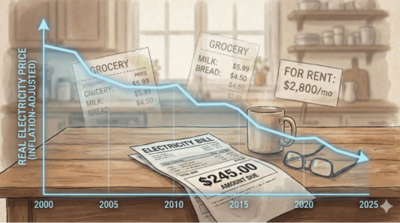
Cover photo: ChatGPT and Google Gemini generated image depicting how inflation causes electricity bills to feel more expensive even when real prices are stable or falling.